Friday 30 March 2012

Evaluation Question 4

4.   How did you use media technologies in the construction and research, planning and evaluation stages?

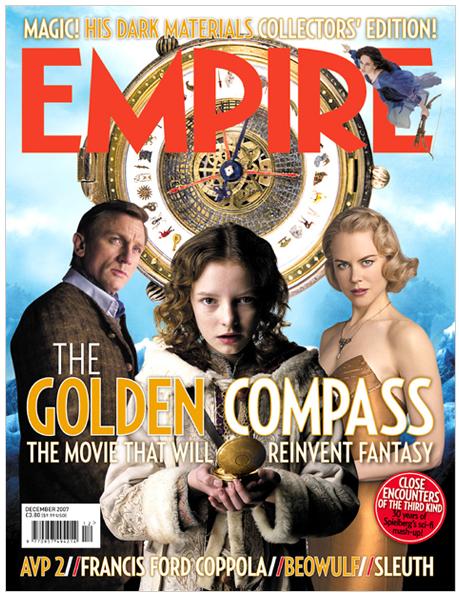
     The first thing I had to do was do research in order to find out as much information as possible that would help with making the trailer and ancillary texts. I began by doing  research into the history of trailers and how they have changed through the decades. I also looked at different genres and posters, I researched teaser trailers and magazine covers. The media tools at my disposal to do this research were Google and Google image. YouTube was incredibly useful for getting film trailers form analysis.  After this I chose the genre of trailer I wanted to do. I drew a storyboard that I could follow when shooting the trailer, I aimed the trailer for a 2-3 minute length. I drew several storyboards before choosing a final one, even this was further refined even as I shot the trailer. 

   I found the shoot to be simple and straight forward and accomplished most of what I eventually used in one day. I used a Panasonic digital palm cam to shoot footage. Most of my research was done online. Any research, planning and modifications I posted on my blog. I tried at all stages to get feedback from my colleagues and teacher. For my ancillary texts I used "Photoshop" to create and edit images for my poster and magazine cover. This tool allowed me manipulate and create pictures and text, I used such techniques as cropping, colour gradients, cut and paste, filler and air brush tools

 I used "Premier Pro" to cut and edit together my trailer. I found this package much easier and a far more powerful tool than "iMovie" which I used last year and found to be slow and cumbersome to use. This package allowed the linking and linking of video and audio. I found to be a very powerful and time saving feature. Video could be linked with layers of sound that can be built up slowly. I allowed the removal of unwanted diagetic sounds and the addition of sounds of my choosing whether diagetic or non-diagetic. The video could also be very easily manipulated, sections of footage could be cut and arranged in the order of my choosing very quickly and with the minimum of fuss. Text could be added at will and made to fade in and at out very easily. All this made the construction of the trailer very easy.
      
    The evaluation was done through a questionnaire which I prepared on Microsoft Word. This was printed and handed out to my class mates, other friends and family that wished to take part. These were then collected and analyzed for to determine what was positively received and what was negatively received. 
    
 All the research, construction, planning and evaluation work was continually updated and posted on my blog account on Blogger. At first I found this media tool to be difficult to use as I had never blogged before. But with practice this has become second nature and I have been able to construct blog pages that contain high definition pictures, videos and text. 

Finally I used a iDVD burning software on my computer to prepare a DVD with my trailer and the ancillary texts as DVD extras.

Thursday 29 March 2012

Evaluation Question 3

3. What have you learned from your audience feedback?

To determine if my teaser trailer and ancillary texts were effective in getting audience attention I needed to get feedback from people. This was not only to see if the techniques I used in the making of the trailer were effective and did their job of enticing audiences, but also to see where I could make any refinements together with the ancillary texts. 

To do this I made a short questionnaire in which people participated by answering short questions about my work. The questions I used are presented below:
  1. Do you think the trailer follows the conventions of the horror genre?
  2. How would you rate the direction of the trailer?, give a rating out of 5 with 1 being poor and 5 being excellent.
  3. Do you have any criticisms, if so what are they and why?
  4. Was there anything that you particularly liked, if so what and why?
  5. How well do you think the trailer ties in with the film poster and the magazine?, give a rating out of 5, with 1 being poorly and 5 being very effectively.
The results of feedback
  1. Most people thought the trailer followed the conventions of the horror genre
  2. On average the direction of the trailer was rated at 3.23 out of 5
  3. This was quite an open question and I got all sorts of replies. Generally there was some criticism that the blank gaps were too long, some complained of motion sickness. The missing person poster shot was unsteady and the antagonist wasn't hidden very well.
  4. The title screen was well received as was the shock ending at the end.
  5. On average the audience rated the trailers effectiveness of tieing with the ancillary texts at 4.17.

Evaluation Question 2

2. How effective is the combination of your main product and ancillary texts?

My main product is the trailer which comes across as spooky and menacing, this is the intention. The ancillary texts in the form of the poster and magazine cover incorporate the same themes as the main product and are therefore instantly recognizable. This makes the combination of main product and ancillary texts very effective. The use of the same font "Cracked" and colour scheme together with the same forest/moon silhouette is distinctive. The narrative themes of the main product are menace, danger, shock and dread. These are portrayed through a combination of jump cuts, first person POV shots low to the ground and frantic running though a wooded area. The soundtrack included diagetic sounds of wheezing and breathlessness, indicating a possible attack or chase. Non-diagetic sounds in the form of spooky background music add very effectively to the sense of dread throughout and heighten any shocks that may come later and particularly at the end when the trailer has seemingly finished. 

Ancillary texts complement the main product. The same colour themes and graphic design are carried over from the trailer. The trailer used the poster backdrop at the end, this backdrop is also used in the magazine cover as well. This helps to tie all three products together which in turn helps to promote the product. The title of the film is plastered in a big font size across the poster and the magazine. The poster also includes positive endorsements from other media sources such as film magazines or newspapers. The magazine cover mentions articles inside covering behind the scenes information, cast and crew interviews and full reviews. All raise the profile of the product.

Wednesday 28 March 2012

Evaluation Question 1

  1. In what ways does your media product use, develop or challenge forms and conventions of real media products? 
The title of the film was prepared in Photoshop using a font and colour scheme that adheres to the conventions of the horror genre. I chose a forest scene with a large full moon in the background, both are identified with the horror genre. I decided to put the title at the end, which is usual in a lot of teaser trailers, I wanted the title to stick in peoples minds and revealed it a spine tingling non-diagetic sound, this also conventional with the horror genre. In addition I chose a forest setting as this gave a spooky and menacing feeling, which is the type of feeling I was going for. The font of the title is "cracked", this denotes a chilling broken or damaged theme, as it is menacing, which is the feeling I want to give to the audience about my film. The positioning of the title in the teaser trailer, the font and the setting are all quite typical of and in keeping with horror teaser trailers. I used spooky white writing over a black background which is also typical of the horror genre. I used red for the background and title font as this also gives connotations of blood and gore.

The setting and location is shown early on in the teaser, this is the norm for horror teaser trailers. It is important the audience know from the start that my film is set in wood, after all it's in the title. This follows the convention of other teaser trailers such as "Friday the 13th" where the setting is made apparent at the beginning and it is obviously a campsite. The costume and props in my trailer were very typical of a teen film. I chose clothes that were as stereotypical as possible, especially with the "hoody youth". 

Camerawork and editing is also typical of a horror trailer, I used jump cuts in rapid succession, sequences running with the camera low to the ground to accentuate speed. I also tried one shot in monochrome to add more atmosphere. I tried to make my trailer as typical as possible, again so that it is obvious from the very beginning it was a horror film. Overall, my narrative and characters representation is very typical of a teen slasher horror. The sound track I used was a royalty free sinister horror themed one, this helped greatly with the atmosphere of dread in the trailer.


    Tuesday 27 March 2012

    Audience Feedback

    In order to check the effectiveness of my product and ancillary texts I produced a short questionnaire for viewers of the trailer. Their feedback would give me an idea of what went well with the project and what might need improving. The questions I asked are as follows:
    1. Do you think the trailer follows the conventions of the horror genre?
    2. How would you rate the direction of the trailer?, give a rating out of 5 with 1 being poor and 5 being excellent.
    3. Do you have any criticisms, if so what are they and why?
    4. Was there anything that you particularly liked, if so what and why?
    5. How well do you think the trailer ties in with the film poster and the magazine?, give a rating out of 5, with 1 being poorly and 5 being very effectively.

    After showing my trailer to friends and family members, the feedback I got showed they were impressed at what is possible with the equipment I had available to me. They liked the way the trailer was constructed and agreed that it followed the conventions of a horror trailer.

    There was some criticism that the blank gaps were too long, between cuts, perhaps those could have been tweaked more. Also some complained that the rapid jump cuts with POV chase shots gave them motion sickness. The shot that lingered on the missing person poster was too unsteady and could possibly have been re-shot using the tripod to steady it.

    The grab scene could also possible have been re-shot, at the time using the small screen on the camera didn't make it apparent that the antagonist hiding in the bushes was visible. I was aiming for a rapid grab out of the blue, however no-one noticed it the first time they saw it, but afterwards because they knew what was coming they noticed someone hiding in the bushes.

    Everyone liked the title screen and how it appeared and loved the shock ending, which by the way was my 2 year old cousin Amira who has a very loud and shocking scream when she gets excited or annoyed.

    I found that the audience felt the ancillary texts complemented the trailer very well.

    Sunday 25 March 2012

    Hood In Da Wood Trailer

    Here is the finished trailer, I have edited what footage I had at my disposal into something sinister and scary. There are some scenes that I think might have gone a bit awry and could possibly have been improved. However my friends after viewing the trailer say they can’t really tell. Initially the trailer was packaged in full HD 1080p resolution, which created a 158meg file. When I tried to upload this to my blog, it was exceedingly slow to upload, I left it overnight, a full 9 hours and it was still not finished in the morning. I decided to cancel the upload and repackage the file to a smaller size and resolution. I tried a 360p resolution which produced a file of around just 0.7 megs, this uploaded without a hitch within 5 minutes. I am unhappy about he resolution I was forced to post but I burned a higher resolution version on a DVD+R and included the ancillary texts as DVD extras.

    Below I present  my completed trailer for ‘Hood In Da Wood’. 


    Tuesday 20 March 2012

    Editing


    I started editing two weeks ago and I have just finished today. Editing did take longer because I was using a different programme but I did find it easier than the iMovie software this time round. Because I have been using my own Mac at home I have better programmes installed to work from. I did for a while have to play with the program to work out how to use the tools and correctly activate functions. This software had a lot more effects to choose from too, and I love the fact that you link and unlink the audio from the actual film. This was a big problem for me with iMovie because I couldn’t figure out how to get rid of the background noise because it wasn’t needed in some shots. This is why I liked using this programme more. Below is a picture of the editing and the shots all coming together. 

     
    I had to create at least two minutes of  trailer. Also because you can unlink audio most of the audio in the trailer was audio unlinked from a different scene that I had filmed for example the heavy breathing, the running sounds and of the twigs breaking. These sounds were all mine that I had decided to use instead of trying to find them on royalty free music websites. But I did rip some music from YouTube which was free.  

    Tuesday 28 February 2012

    Filming

    I started filming on January 27th and finished filming today on the 28th of February. The filming went generally well and I managed to get all of the appropriate shots I needed. Filming this time round I was more confident with how to handle the camera, I knew exactly what I wanted to get out of the camera. It was the same with the tripod which I didn’t need much of the time this time round as most of the the shots were constructed by running with the camera to simulate running in a blind panic. 

    When I needed to redo some of the shots everyone understood what was needed, so nothing was difficult to do. Generally because of the simplicity of the shots was a surprisingly easy shoot. Now that I have finished filming and also have all the shots that needed to be corrected, I will be editing between now until I have finished.

    Wednesday 22 February 2012

    My Production Logo Design

    While editing I was brainstorming a few ideas on how I wanted my production logo to look. This time round I was more knowledgeable in using the software Premiere Pro on the Apple Mac computer and I came up with something simple and I think impressive. Initially I brainstormed ideas around 123 and ABC productions and then while fiddling with the software I came up with ‘Two Two Mirror Productions’, I liked this name it's catchy, simplistic and now all I had to do was make it.  While doing so I played with the word mirror so I decided to make a reflection of the word two. Below you can see the final product. 


    Monday 20 February 2012

    Research - Production Logo

    Production logos are often used as a brand, to market the quality of a movie, what genre it represents as well as signifying to the viewer who funded the film. These are used by a wide range of entertainment media companies, TV studios, film makers, studio theatres and animators. Production Logos are often seen at the beginning opening credits of a movie, if not always, and they play an important part in marketing what theme the movie will be about. For example, Walt Disney movies, are generally U certificate, PG or 12, it’s almost a natural order of film making that this company will not make or produce something with a 15 or 18 cert, which may follow more mature themes. The type of movie they market will be suitable for a young audience or for families, therefore, when an audience see’s their brand at the opening of the movie, they are comforted in the knowledge that the movie can be viewed almost universally by all ages.


    Although, production logos are not just used for the consumer alone, companies need the opening films for advertising space for themselves. If the slot at the opening of films or at the end were not available to place the logo it would reduce the marketing and advertising advantage for the entertainment business, therefore it is a necessity. However, most movies usually show a production logo at the beginning rather than the end.

     
    There are many production logos that are established and represent that the director or the filmmakers have had money put into the making of their movie, these are the likes of MGM, 20th Century Fox, Warner Brothers, Walt Disney pictures, Universal, and many more. These are all successful and longstanding giants above the likes of Pathe, Ealing studios or the BFI. Initially the graphics for a Production Logo would be represented by a cinematic theme, e.g. 20th Century Fox have searchlights which sweep, as would be the characteristic of a Hollywood red carpet party. On the other hand, with MGM, although the lion does seem random, it is representative of when viewing entertainment were Circuses where lions were a main attraction; beneath the lion the image is a theater mask again referring back to visual entertainment. These images refer back to examples of visual and theatrical entertainment, and therefore the graphics are not random but make references to what the branding is about. However the trend is different today, production logos are more about the company, rather than what they represent, Pathe on the other hand has a rooster which is the graphic for the logo brand. DreamWorks although successful and established, is a young studio company founded in 1998 in comparison to the likes of MGM and Fox Light. The graphic of the boy with a fishing rod sitting on a moon crescent in the sky, this may seem as if this does not represent TV or film entertainment, however the use of this was to follow the current trend into CGI, many movies were beginning to use computer generated images for movie making. The founders of DreamWorks therefore wanted to characterise this. Hence the name and the logo do fit, although it may seem initially that the usage could seem random.


    Furthermore, pre 1990’s production logos were often ‘still’ images, however, as film making advances, production companies are under pressure to keep up with viewing habits. 20th Century Fox now have moving searchlights, Pathe now have an animated logo, where the name ‘Pathe’ is on a string, and as it turns the shadow is that of a rooster. However, Pathe when founded in 1908, was a production logo used not for entertainment, but for broadcasting news. However in current years, has made the move to producing and funding films, particularly less mainstream quality movies. It is now a strongly advocated company in regards to film making and has earned its position amongst the ranks of more Hollywood and LA based film studios.


    As you can see with the MGM logo, the competition, year on year increases for movie makers, and for studios, they have continuously evolved their logo’s to keep up with trends and cinematic technology. As you can see below, MGM, which had a ‘moving’ production logo of a lion roaring, has become over time colourful, as filming moved forward from black and white motion pictures to colour, and now today from standard filming to computer generated images. Here you can see how their logo has evolved, and will continue to as technology in filming continues to evolve too.

    Friday 17 February 2012

    My Film Magazine Cover

    After my magazine cover research, I started to brainstorm ideas how to make my magazine cover. I wanted in the end to make a magazine dedicated to one type of genre. So I decided to make a horror film magazine. From the research I had many ideas on how to construct a magazine cover. The software I used to make the magazine cover was Photoshop. I used this software on my Mac home computer. I did at first have to fiddle with the layers and the gradient colour filter before I actually started, as I had got a lot of practice using Photoshop when I constructed my poster the magazine cover was easy. Below you can see a picture of the magazine cover in progress.


    While making the film magazine I wanted to add a few more USP's to make it stand out more and draw the most attention. I did this by going onto a royalty free website called Deviant Art from here I filtered out some horror images and chose a few to include on the magazine cover. 

    It didn’t take me long to have a magazine film title because I just played with the words ‘Fangoria’ and made ‘Gore-Mania’. I used blood red and black as my colour scheme, this is common to the horror genre convention. I liked the idea of using a section of film strip containing picture stills of other possible articles. This film strip convention is not only common to Fangoria but I've also seen it used by the more mainstream magazines such as Empire and Total Film. Another USP I included was that of the free poster, also common to many popular film magazines. 

    I included a bar code for added realism and placed the issue date and price on the top left hand corner. This is unusual, most magazines place the price near the bar code and the issue date on the top right, usually below right of the title. Under the title I included a humorous strapline "You'll need your Mummy, reading this magazine...", using the "play on words" double meaning of "mummy" in the context of the horror specialty of the magazine. 

    I exploited the rule of space convention and avoided any text above the horizon leaving a large vacant space in the middle of the magazine cover. I also used another USP in the form of an exclusive behind the scenes look at the featured film with the features listed justified to the right in bold yellow text. In addition I added another USP calling the magazine a "special edition". Aside from the title of the featured film which used the same font as the promotional poster, all other text on the cover used the same font as the magazine title text except the date, price and edition text which used another font.

    Below you can see the finished product.


    Wednesday 15 February 2012

    Research – Magazine Covers 7 Fangoria

    Fangoria is an internationally-distributed US film fan magazine specializing in the genres of horror, slasher, splatter and exploitation films.

     
    The magazine cover mainly focuses on horror films. Which is why there is a dead woman on the front cover, next to the picture is the title ‘Ghost Story’. The left hand side shows a section of film strip containing 3 pictures with bright bold yellow text underneath each indicating several other articles inside the magazine. The colour scheme is all dark with red and yellow. The title font fits well with the theme of the magazine as does the title itself,  it proudly proclaims what the magazine is all about, "fangs" and "gore". If your in any doubt then it also includes a strapline under the title proclaiming what else the magazine likes to cover, "Monsters","Aliens" and "Bizarre Creatures". The magazine sticks to this layout convention from issue to issue, hardly ever deviating from it.
     
    Below are some more examples:


    Monday 13 February 2012

    Research Magazine Covers 6 Variety

    Variety is an American weekly entertainment-trade magazine.


    This magazine cover features two of the main characters from a James Bond film, they also show the Bond logo. The colour scheme is blue shades in the background and black suit for Bond and dark mauve for the Bond girl. The text uses a bold white font and all of it seems to be dedicated to the Bond film, no other article is mentioned.

    Below is another example, this seems more conventional, with a title banner across the top using Variety's distinctive font in the largest size of any font on the cover. The cover features a publicity close-up still of George Clooney from the film "Descendents" and all the text is left justified in a column on the left, carefully avoiding his face.  Again all the text is dedicated to the featured film, no other articles are mentioned.


    Thursday 9 February 2012

    Research – Magazine Cover 5 Starlog

    Starlog was a magazine specializing in science fiction and fantasy genre of movies, television series, and books. 


    The front cover shows the main character of the new film ‘Conan the Barbarian’. It shows him holding a weapon; there is  text right next to him in bright yellow emphasising that you can read the reviews in this magazine. The colour scheme for this cover is mostly yellow, orange and white. They are a very bright colour scheme.This draws the attention to the text as it stands out from the background. Generally this magazine list its articles in bold, bright text in a column justified mostly to the left. In some cases where more information is needed on the cover, also to the right


    Reference: http://en.wikipedia.org/wiki/Starlog

    Saturday 4 February 2012

    Research – Magazine Cover 4 Sight & Sound

    Sight & Sound is a serious film magazine, it reviews films with the sort of literary rigor reserved for books, this may be because  the magazine is the longest running film magazine in the country. The magazine reviews all film releases each month, including those with a limited release, as opposed to most film magazines which concentrate on those films with a general release. Sight and Sound is also known to include a full cast and crew credit list for each film reviewed .


    This magazine cover shows only the director of the film instead of any of the main characters from the film. This shows the kind of magazine that Sight and Sound is, it is not interested in hype. The magazine title banner remains consistent from issue to issue and hardly ever changes. The covers usually feature stars or directors in simple poses, generally specifically shot for the cover. This is in contrast to Empire or Total Film which tend to use material given them by the studios. Sight and Sound tends to list more of their features on its front covers than other magazines. Fonts they use are generally less eye catching and less colourful, presumably because their philosophy is not to promote but report.


    Wednesday 1 February 2012

    Research – Magazine Cover 3 Film Review

    Film Review was a very popular monthly film magazine, it specialised in film related news and information, its approach was a little more high brow than Total Film or Empire but they none the less appealed to those interested in the more mainstream releases. It ceased publication in 2009.

     
    I have found this magazine cover on the internet through Google images. I thought it would be good to analyze the main conventions of an older magazine cover. You can see that the picture of ‘James Bond’ aka Sean Connery is covering a part of the ‘Film Review’ title this is okay, as it is such a well known magazine that people will still know what it is. 
    It also talks about other films and articles that the magazine will have and most of these are showing these because of their popularity. I like the style in which ‘Film Review’ is laid out; there is also a quote from a reviewer of the film, which is a good tactic to use to lure the reader in. This will make the reader want to know more about the film, as it has had good reviews. I could also include this convention.

    Also most of the space is dedicated to Sean Connery there no other small pop ups showing images of other film inside the magazine only text is shown and that at the very sides to making sure they don’t cover his face. This is a really good technique to use because all of the attraction will be on the main character, this will draw the reader to what we want them to look at (voyeurism).

    The color scheme is also picked to fit in with the character that is featured on the front cover; so for example, this one is bright and white to fit in with his suit and gun. Below the are a few more I found, notice how they use more unfamiliar conventions the older they get. The oldest magazine uses a bubble to highlight a feature and the fonts are smaller, less colourful and less appealing.


    Monday 30 January 2012

    Research – Magazine Cover 2 Total Film

    Total Film is a British film magazine published 13 times a year by Future Publishing. The magazine offers film, DVD and Blu-ray news, reviews and features. Total Film has the largest circulation of any film magazine in the country, after Empire magazine.


    Total Film specialises in a range of features, from interviews and photo shoots with established and up-and-coming actors and directors, to major film previews and retrospective pieces. All issues contain the Total Film Interview this is an in-depth chat with a celebrated actors or directors, along with a critique of their body of work.Total Film competes for the same sort of market as Empire Magazine, both place more emphasis on covering mainstream and popular films than smaller independent or art films and it also tends to take the same sort of reverent approach when reviewing new films.

    The front cover of the issue of Total Film below features Sherlock Holmes as it was the big studio release of that month.

     
    The magazine title is the biggest and boldest used on the cover. The colour scheme seems to be white and blue, this gives a distinctive feel to the cover. The main feature which is Sherlock Holmes film is plastered over almost half the page. The magazine also exploits a USP in the strap line "World Exclusive!". Other features inside are given less space and spread out around the periphery, but the use of large blue titles draws the attention to them.


    Below are a few more that caught my attention, sometimes covers are dedicated to a theme, which in this case are comic book heroes. Also I noticed aside from their title Total Film are not afraid to experiment with different layouts for their features and tag lines.


    Saturday 28 January 2012

    Research – Magazine Covers 1 Empire

    Empire is a British film magazine published monthly, it is the biggest selling film magazine in Britain, consistently outselling its nearest market rival Total Film. Empire is popular because it tends to cover popular releases, is well informed as to what the tastes of popular culture are and it is irreverent in its approach when reviewing. It specialises in film news, previews and reviews, Empire has some unique regular features,  such as the "Classic Scene", this is a transcript from famous film scenes.


    I will now begin to analyze one of the Empire magazines covers in detail.

      
    Empire magazines are known for using a lot of different fonts and sizes on their magazines. The featured film on the cover is Sin City which is given the main prominence. The main picture is of John Hartigan played by Bruce Willis from the film Sin City. The magazine also shows a number of unique selling points. For example interviews, previews, DVD reviews and movie reviews. This will attract people to what’s inside the magazine.


    Below are a few more that caught my attention:


    Reference: http://en.wikipedia.org/wiki/Empire_%28film_magazine%29

    Thursday 26 January 2012

    Research – Magazine Covers

    I have just started to look into making the front cover for our magazine. To do so I decided to research into magazine covers this is so I can distinguish the features that all magazine covers have. And what other unique selling features they add for the magazine to stand out and draw people’s attention. Most magazines features have the following:
     
    • The Magazine Title
    • A few articles that will be featured inside the Magazine
    • A Bar Code
    • A Tag Line
    • A Dateline
    • A Selling Line
    • Free Posters or front cover DVD

    Wednesday 25 January 2012

    My Film Poster - Hood In Da Wood

    After the research I did on film posters I gained many ideas on how to construct my own poster. I wanted to include some of the poster techniques and elements I researched. For example the rule of space, typography and genre conventions. Unfortunately I can’t use star appeal as there are no famous actors in my trailer. 

    I started with a royalty free image of a forest silhouette from Deviant Art. I manipulated it together with an image of a full moon enlarged and used as the back drop to make my film poster. I used Photoshop to manipulate all the images and text in my poster and had to reacquaint myself with some of the tools in the software. 

    Below you can see the poster in progress. I started by merging the moon and forest silhouette together and then using a blood red monochrome filter I incorporated a genre convention.


    I had a lot of fun designing this poster particularly as I used funny in jokes and quotes only my friends and family would understand, for me this gave it that finishing touch. I also played about with the glow and texture to make sure the quotes stood out. I did have trouble with the colour gradient for a while which I achieved through trial and error. Initially the image I made was in landscape orientation while the poster was in portrait orientation. Initially there was a black bar above the moon which I wanted to avoid, I wanted to match the background with the picture and wanted it to blend in with the different shades of dark red to black. Through trial and error using the colour gradient tool I managed to get a pretty close match. There was still a faint line that was noticeable, here I plastered the title across it and raised the external glow, this masked the join effectively. For the title I used the font "cracked", this had the right sinister feel to it that I felt matched the theme of the poster. Below you can see the finished film poster.


    Sunday 22 January 2012

    Research – Film Poster Strapline

    This is the line of text on a movie poster that gives us a little more insight into the film, sometimes creating Enigma.

     
    • Strapline gives us a clue that this is a crime film.
    • The Strapline “Welcome to the bank robbery capital of America” clarifies this is a crime film but we know exactly what to expect because the word “Bank robbery” suggests there will be a bank robbery of a lifetime. This also ties in with the image of the people wearing the disguises. 


    I will use this research to help prepare my own poster incorporating some of these techniques.

    Friday 20 January 2012

    Research – Film Poster Rule Of Eyeline

    This is when a character on the poster is looking somewhere and you follow their eyeline. 

    • Girl is afraid and is trying to look back. We follow her eyeline and look at the shadow behind.

    • The film makers and poster designers have used Rule of Eyeline on this poster to draw the audience’s attention to where the girl is looking.  This makes us feel uneasy because we can see what she can’t see, which is why the expression on her face it is terrifying.  Interestingly, when this happens, our eyes are also guided straight away.

    Wednesday 18 January 2012

    Research – Film Poster Rule Of Space

    This is where large expanses of the poster do not contain an image or detail. 

     
    • Large black space here suggests something lurking in the shadows, maybe something that is about to get her.

    • Here, the large expanse of black space around the girl’s face makes us feel as though there is something threatening and frightening lurking in the shadows. Shadows are a horror convention.

    Monday 16 January 2012

    Research – Film Poster Typography

    This is when fonts are used to create an image of the film, matching the genre. 

    • The font looks spooky and ghostly and matches the theme of the title
    • The typography used in the poster highlights this is horror genre because it suggests a supernatural/sci fi theme from the spooky font used for the title. The writing also looks like the mist.

    Thursday 12 January 2012

    Research – Film Posters Genre Conventions

    These are rules of the genre, certain storylines or features we expect to see from a specific genre.

    • Black white and red colours are commonly used in horror film posters; they signify good, evil and blood these are known as the typical conventions of a horror film.

    • There is a shadow on the door but no one is standing there to make that shadow also signifies that it is a horror film.
    • The title also gives it away by saying paranormal which means anything that is beyond or contrary to what is deemed scientifically possible.